Signal AI
‘Signal’, as the company was referred to when I began working with them, were an AI tech start-up company straddling the difficult ‘puberty’ phase of a new business - accepting they were no longer a startup and were in fact a scale up, with the need for some brand direction and structure to their positioning in the market as a disruptive challenger brand. They had recently undergone a rebrand but it was impossible to activate against the new guidelines and I had to rebuild from the ground up. The challenge was not rocking the boat too much after such a hefty investment but realigning the work undertaken with the company vision and making it more dynamic, inspiring and innovative.
Beyond this, we had to create a brand that people could relate to, that stood out on the competitive landscape and showed a more human side to AI - whilst also positioning the company as tech innovators and thought leaders.
Logo redesign / re-written tone of voice / website redesign / re-written guidelines / design principles created / campaign thinking & strategy / category creation / social media / resource design / deck and collateral design
Logo redesign
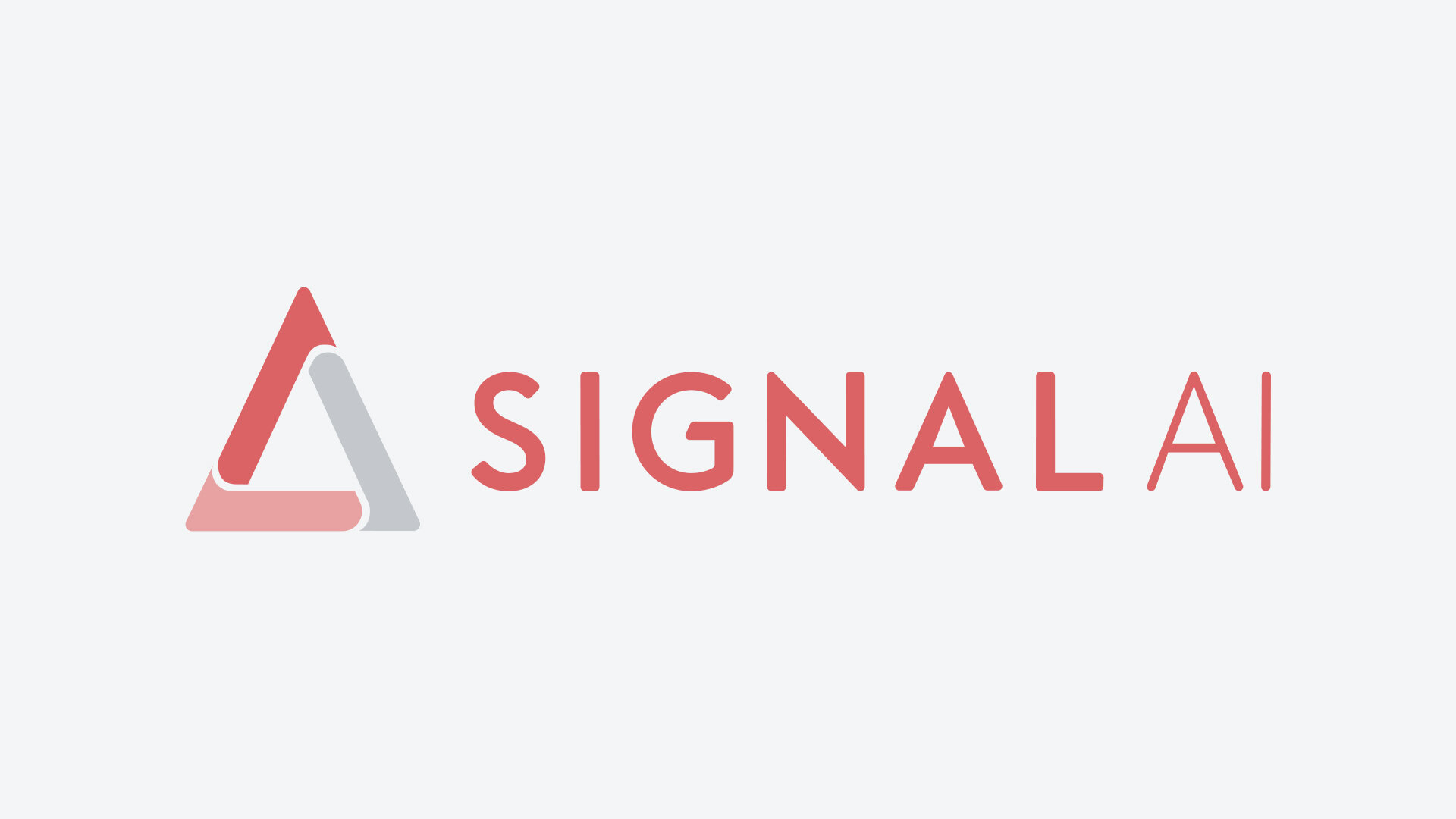
One of the challenges facing the brand was the fact the company name is actually Signal AI and the ‘AI’ element was hidden in the previous design. The logo did not say the full name and could not be reproduced in single colour print, wasn’t very friendly in digital spaces and it was important we future proofed the brand by redesigning the logo. We didn’t want to move too far away from the existing logo as it had just been redesigned in Q4 2018 and we didn’t want to lose any brand equity already accrued from being ‘in the wild’ for a year or so. We kept the ‘pyramid’ shape (the ‘A’ in the previous logo) as an own-able brand device (as triangular forms have lower weighting making the mark feel more stable and secure), kept the same letter spacing, rounded the edges on the letterforms so they weren’t so aggressive and put ‘AI’ in a lighter weight of font so it appeared more sophisticated. The pyramid being broken up not only allows for easy reproduction but visualises the idea of the convergence where Signal AI brings together human and machine learning to create better results for business professionals.
Signal AI Brand Guidelines
The previous brand guidelines were dark, heavy and uninspiring. Their purpose, to help those whose job it is to execute on the brand were previously unclear and did not fully articulate the brand purpose nor offer much guidance to readers in how to create effective executions on the brand. This realignment project meant reshooting team photos, turning the colour palette on its head, creating a more friendly aesthetic and overall ‘turning the lights on’ at Signal AI.


