
Signal AI
Design Principles document (2020)
As part of the wider brand redesign for Signal AI I crafted a set of design principles that would act as a reference tool for anyone designing for the brand. It was important to distinguish this document from the brand book and guidelines because I wanted to be as explicit as I possibly could in how to design for the Signal AI brand at more of a deep dive level.
In the document it is clear how to work with the logo, how to work with typography, how to source photography, how to work with the colour palette, how to design for decks and presentations, social media and marketing swag.
Design principles / brand governance / designer tools
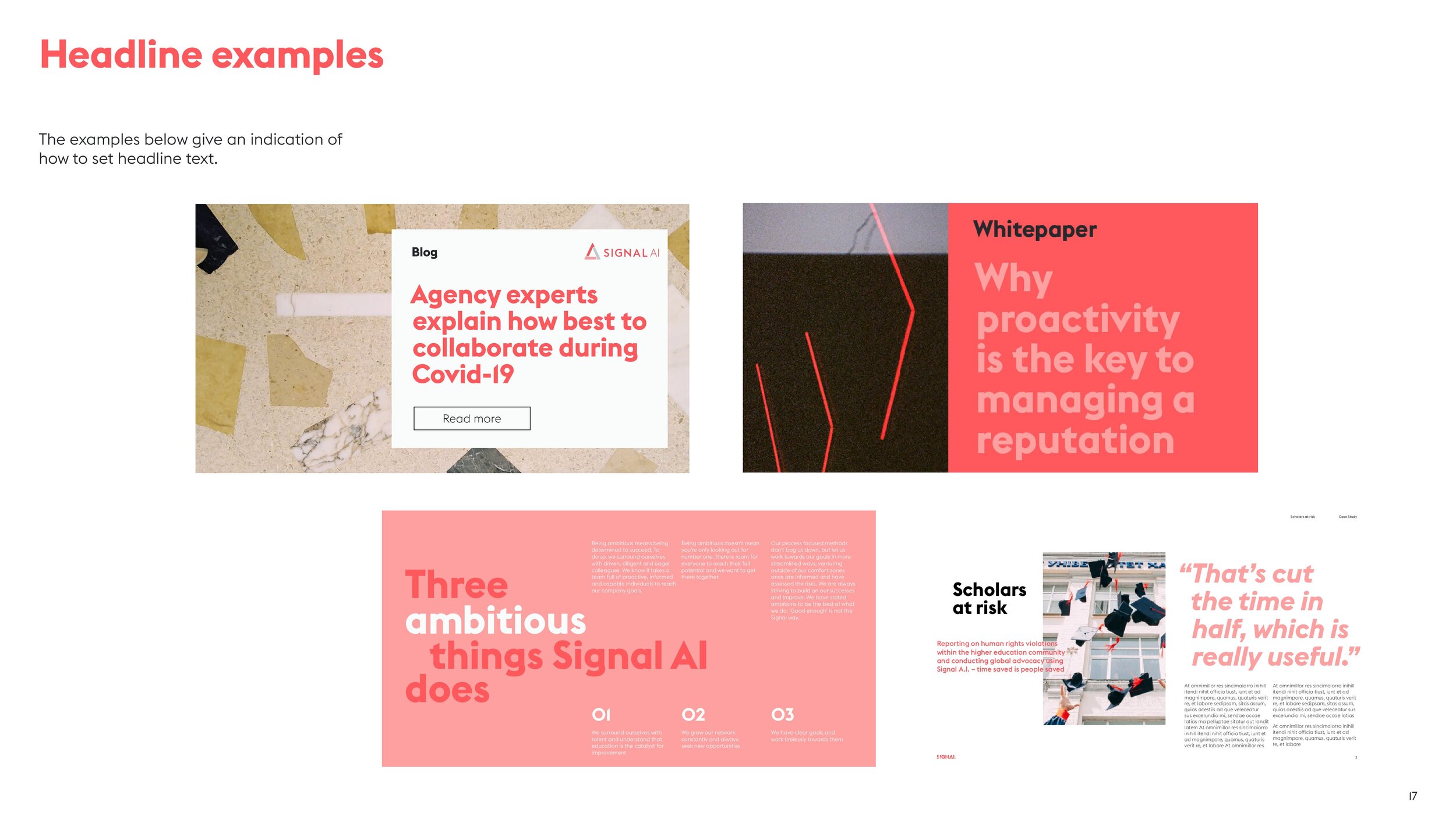
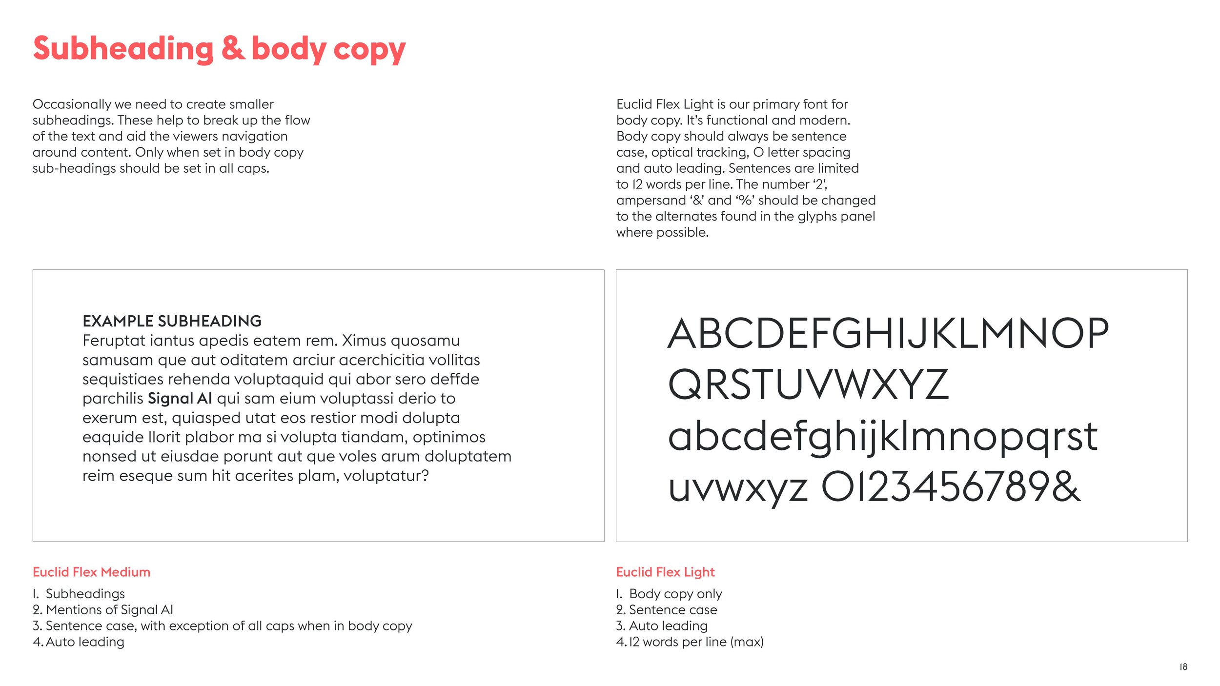
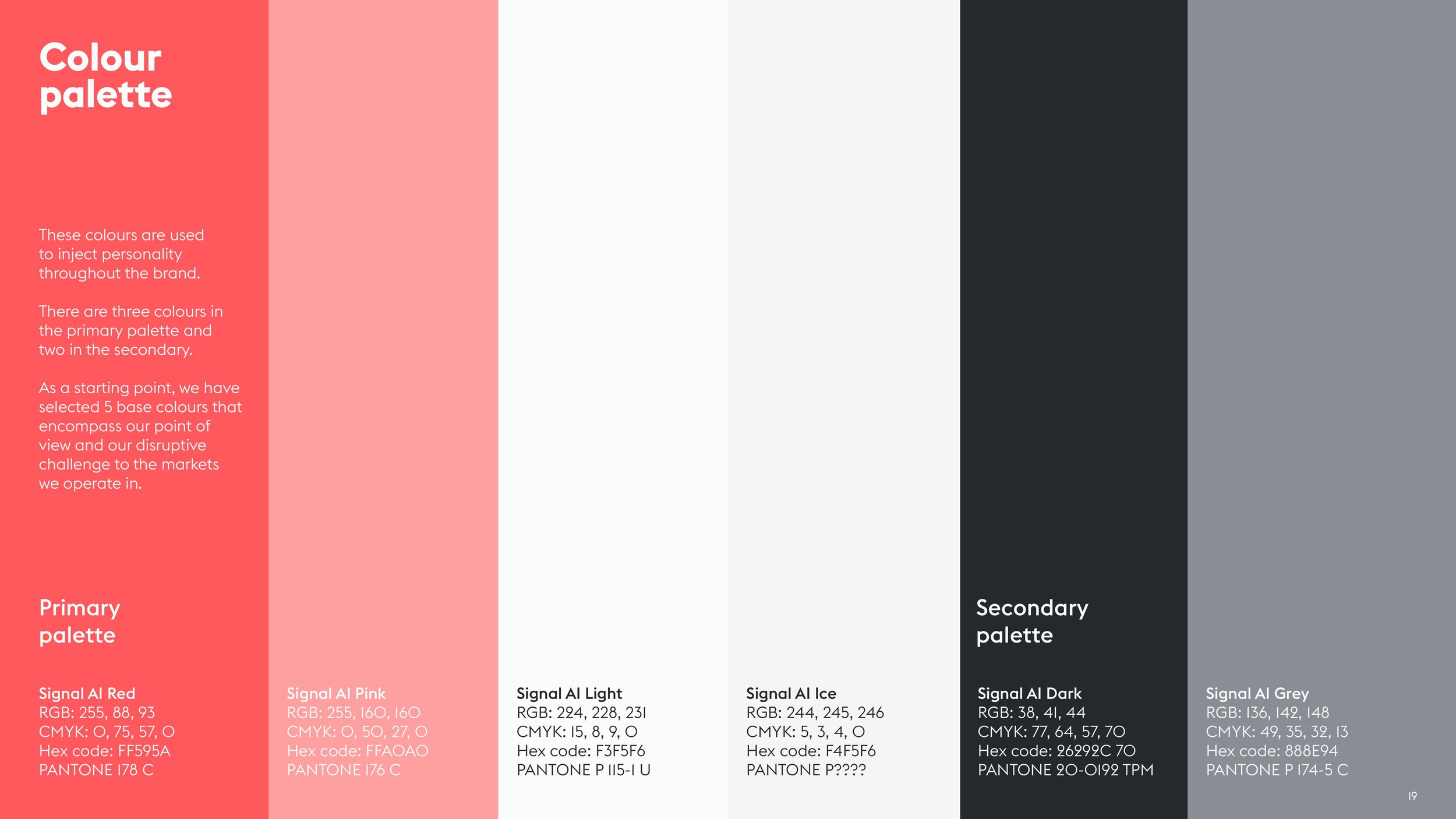
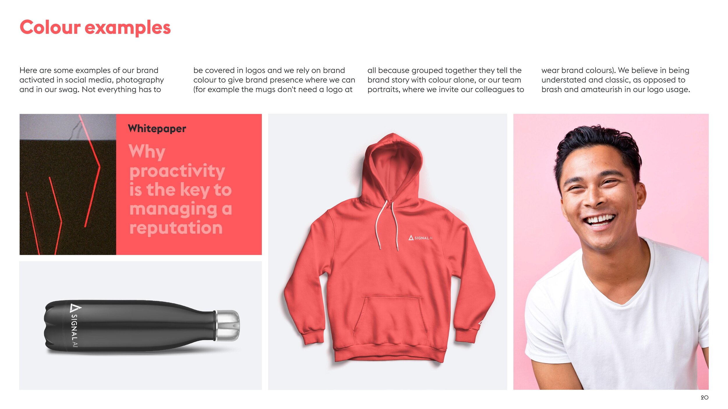
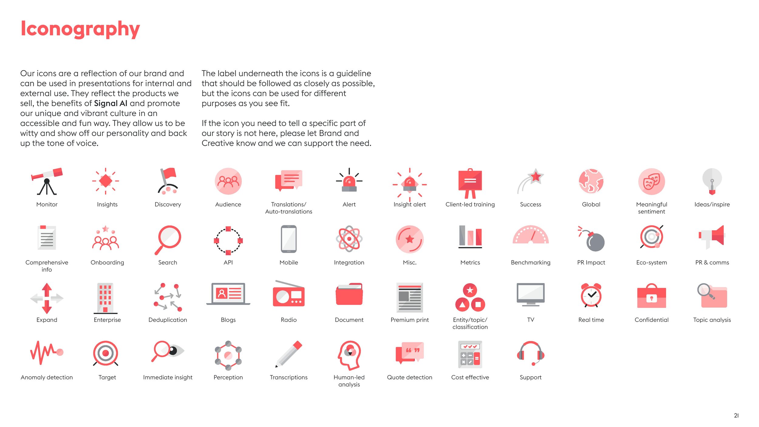
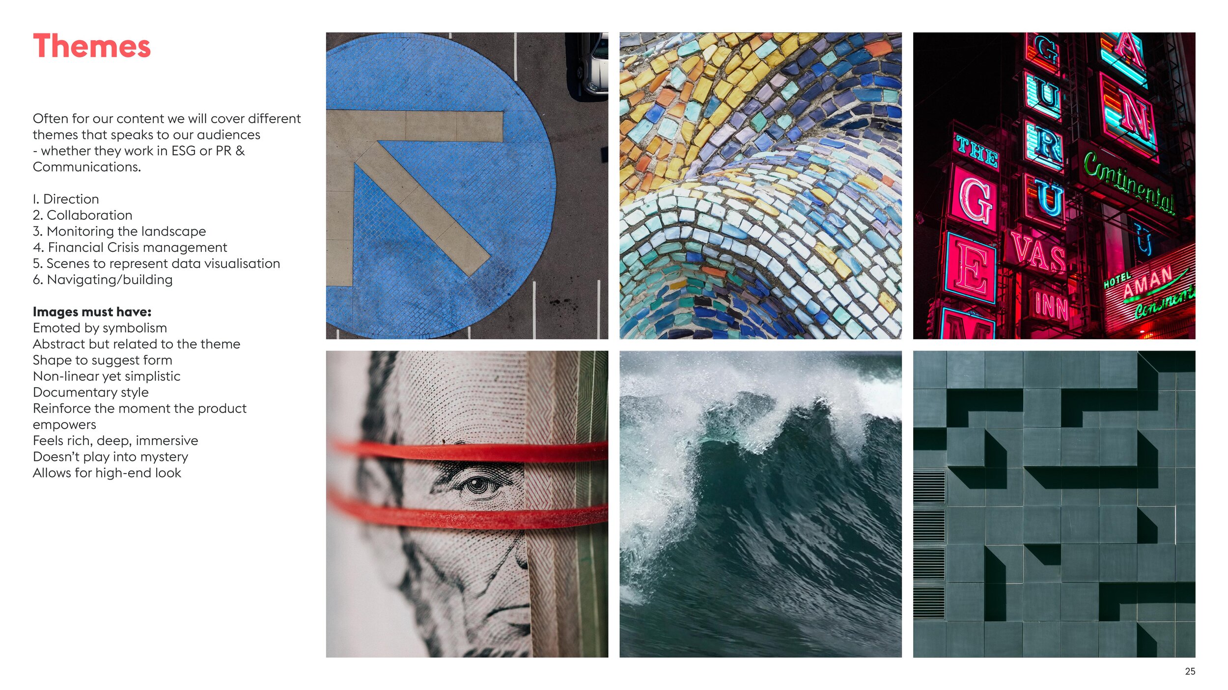
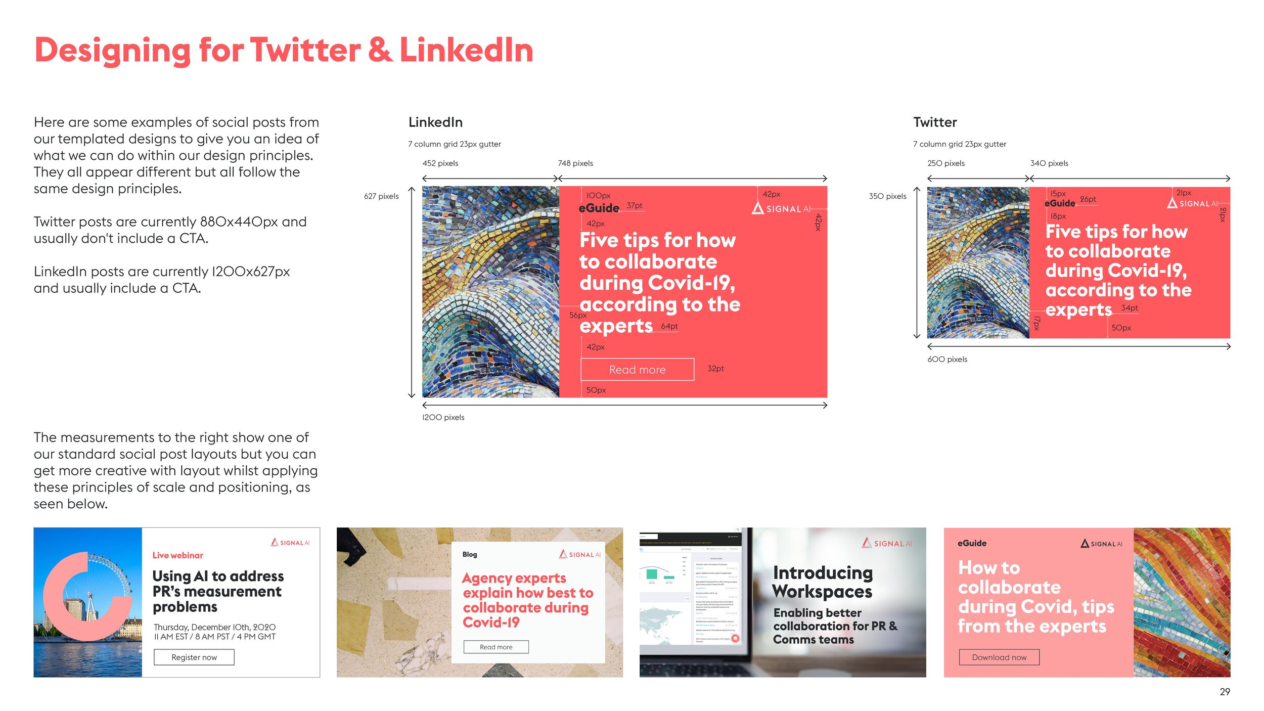
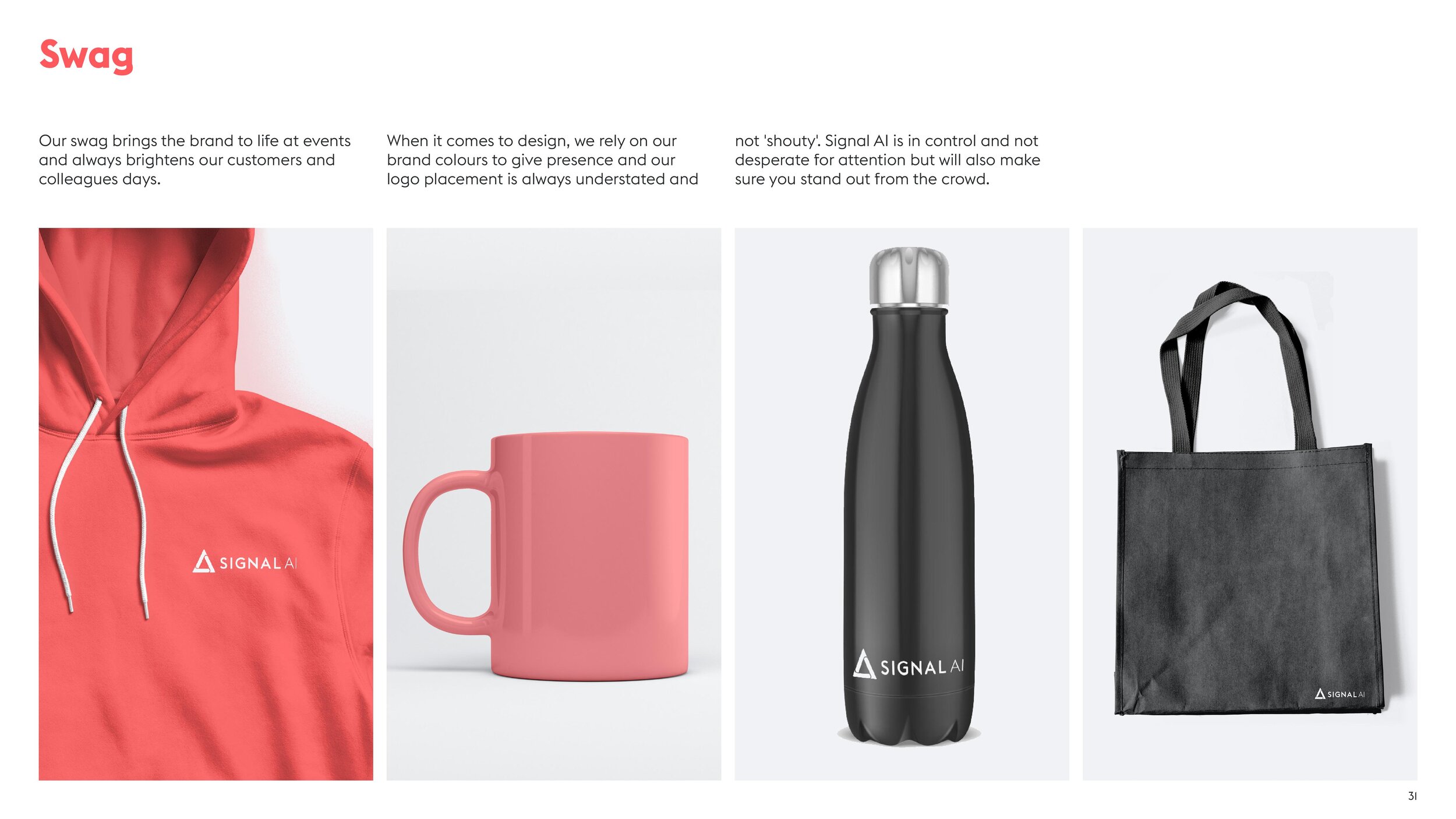
Please note this is an abridged version of the full document.
Signal AI website
The problem
Part of the wider rebrand project was to relaunch a fit for purpose website for the company that they could be proud of, fully articulated their story and position them as the leading brand in augmenting decision making for business leaders. The previous site design had the old branding (too cold, lacked personality and wasn’t consistent). There was no clear tone of voice on the site and it was dry and one-noted. The overall design aesthetic was missing modern design elements such as movement and the positioning, how we told our story, who we are and what we do was also unclear. Visitors had difficulty seeing the full scope of offerings, and there was a lack of keyword focus, proper meta descriptions did not exist, insufficient snippet summarises (page descriptions on search engines), with a high bounce rate (73%), entry point home page doesn’t address all buyer personas. All of the templates in the back end were hard coded and left no room for customisation.
Website design / UX design / UI design / planning / management / strategy
The solution
Design and build a website that clearly articulates who and what Signal AI are and put the use cases up front and centre on the homepage to help visitors navigate to the relevant information for their specific persona.
Create a website that works across all devices and screen resolutions.
Have an improved UX experience for visitors with a global navigation that was clear and easy to use.
Clear page hierarchies.
Extend the brand interaction to the website so there was a clear connection between all front facing comms.
Create a flexible set of templates for the Signal AI website that would allow the team to add/remove/duplicate content as and when they wanted without having to incur agency change request fees and empower them to use the site more.


Since launching the site in Q4 2020, the website has become a catalyst for developing the brand positioning to lead with value. Signal AI has seen growth in US monthly organic website traffic particularly, growing from 400 in early 2019 to 1,300 by the end of 2020. Leading with US English and putting value based messaging at the heart of the website content we managed to see YOY growth in organic website visitors across the board with a drop in bounce rate.
National AIDS Trust
Rock the Ribbon - logo design (2019)
World AIDS day was falling off the radar, and National AIDS Trust needed people to feel proud of supporting people living with HIV, and be proud to wear the iconic red ribbon.
So in the lead up to World AIDS Day, St Lukes London invited the world to #ROCKTHERIBBON.
Logo design / identity design / OOH


They launched a film starring Childish Gambino’s ‘This is America’ choreographer Sherrie Silver proudly rocking a red ribbon with stunning dance moves, narrated by Stephen Fry and they even invited the public to rock the ribbon by dancing themselves, raising donations with a media-first digital billboard at Westfield on World AIDS Day. So far the call to action has achieved over 60 million organic impressions, gaining the support of celebrities and organisations around the world.

The project was winner of Ocean Outdoor's annual innovation competition. The team created a giant real-time motion-controlled dance game where users saw themselves 'Rocking the Ribbon' at Westfield Stratford. It was a hugely challenging project for World AIDS Day, against an aggressive deadline, which played its part in helping the campaign go global.
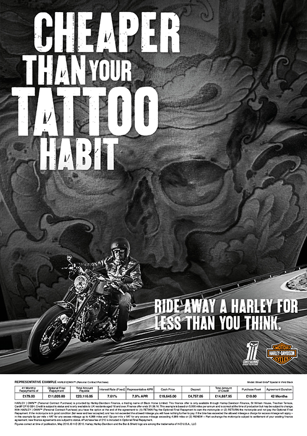
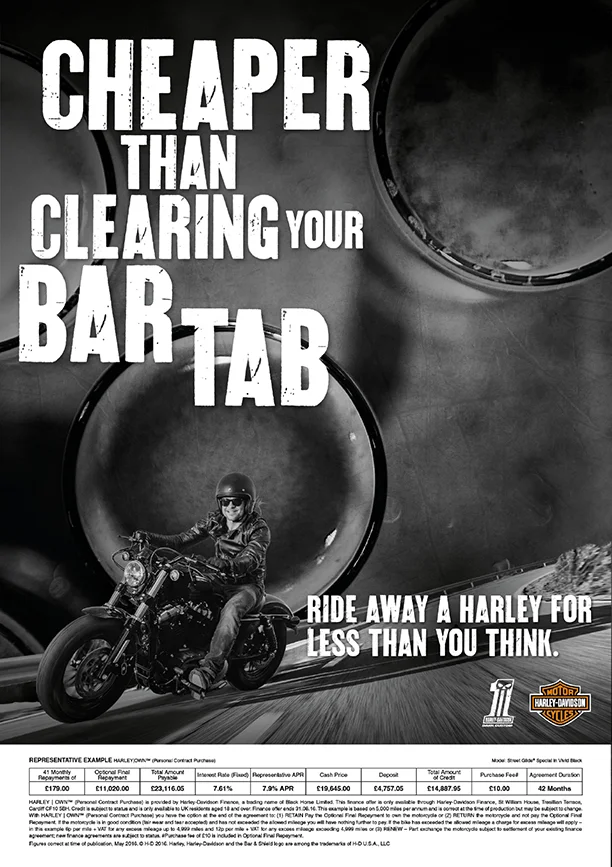
Harley Davidson
‘Affordability’ campaign (2017/18)
Art direction and Design for the Harley-Davidson 'Affordability' Campaign to drive sales of H-D bikes to existing and new customers. Working closely with the team, my role was to create impactful collateral for in-store dealerships, press ads, digital display ads, social posts, home page skins and posters.
Art direction / design / layout / typography / advertising / campaign


SEAT
The Missing Car (with ITV idents) 2016
Fully responsive game design for the SEAT ITV idents sponsorship to promote the SEAT Ateca at www.missingcar.com.Putting you at the front line of the investigation, the Missing Car game uses the setting of the show together with clues to solve a mystery. Developing week-to-week, you can save your progress, share on social media, and most importantly, be in for a chance to win by closing the case. Every week would feature a specific product feature.
Interactive / digital experience / campaign / through the line


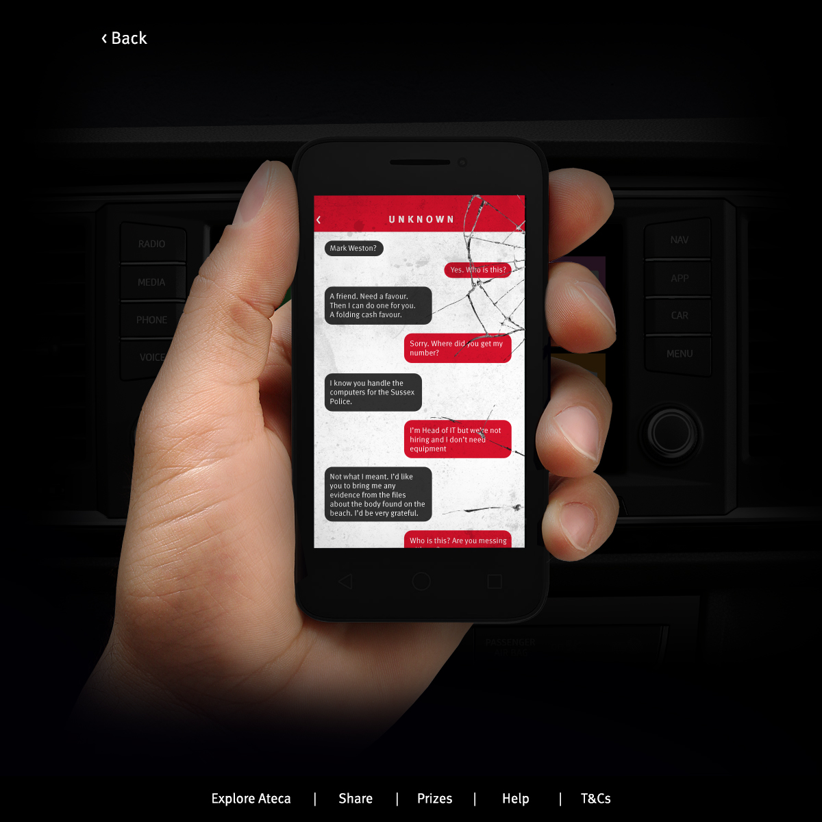
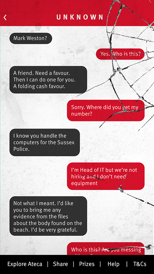
A nice breakdown of the UX can be seen here: http://ux-universe.com/pages/portfolio/seat.html
Rowse
Website redesign (2016)
The brief was to redesign the already out-dated website for the UK's favourite honey brand, Rowse Honey. Whilst embracing the Oxfordshire-based heritage of the company the challenge was to communicate a more modern and fresh feel to fall in-line with the new above the line campaign.
Website / redesign / UX design / UI design / management / build

The new design is fully responsive with a unique mobile version of the site for those on the go who are aching for honey knowledge. My favourite part of the site is the hero area on the homepage which once it hits a particular break point swaps out for static imagery - giving the client the flex to run with promotions or lifestyle photography/graphics, and also means users on mobile devices load the page up faster offering a smoother user experience.